Posts tagged: Website Critique

Website Critique: Hollywood Style Scrubs

Carey Bennett designs clothing for a popular TV show SCRUBS among other shows. Now you can get these soft, stretchy, and sophisticated scrubs for real health care professionals. The following website critique is for www.BestEverScrubs.com where you can buy these Hollywood Style scrubs and accessories.

Limited time offer Free Video Website Critique for Small Business

Every website should have a predetermined action that they want the visitor to complete when he/she arrives there. Help your visitor get where you want them to go by creating a call-to-action. A call-to-action can be in a form of a button or some type of message that tells the user what to do. For example on Best Ever Scrubs website this call-to-action can be “View our new PocketShirts” where a button takes the user directly to the PocketShirts page.

Overall Improvements

• Reorganize the navigation. Make the navigation that the users will use to “shop by” as the primary accessible and easy-to-use. Currently the top navigation gets users primary attention, but it really doesn’t assist them in the buying process.

• You have a great opportunity to promote your products by showcasing the celebrities that wear them. Don’t hide those images just inside a portfolio section.

Home page

• Stop the Flash animation from auto replay and minimize it so it gives room for more important information.

• Bring up your offers and new items to the top where users can see them immediately. Most people don’t scroll all the way to the bottom, so having your new items and promotions there makes you loose sales.

• It’s great that you’re participating in all the Social Media, but listing them on the homepage where you have it, takes up room from promoting the things that you want to sell.

• Reorganize your homepage where you have a call-to-action that prompts the user to do something. Currently just viewing the Flash animation doesn’t prompt the user to explore your products or perform any other predetermined task.

• Grab peoples attention by placing “As Seen On…” the homepage. It doesn’t have to be big, but it will get more interest than the Flash animation.

About page

• Your story is great, just add your photo so people can relate better.

More website critiques

Limited time offer Free Video Website Critique for Small Business

Of course there are more things to review to make this website better such as search engine optimization, but this is a whole different subject and will require it’s own review.

If you’re reading this review and want to add more suggestions, please add your comments below.

Disclaimer

The video website critique and suggestions are for you to review and take what you feel will better your business website. There’s no guarantee that the suggestions mentioned will improve your business. Design Leap is not held responsible for any negative outcome.

Website Critique: Unique, motorized cooler wagon

An exciting, unique invention the Coolerwagon, is an all terrain motorized beach wagon that is in version 3 of it’s development process. This website critique is of it’s website www.coolerwagon.com where you can see the progress of the Coolerwagon’s development and buy other beach items that you might need for a relaxing day out in the sun.

Limited time offer Free Video Website Critique for Small Business

Overall Improvements

• The overall look of the website can be cleaned up and brought up to today’s standards. But the navigation is easily found and clear to understand, which really important for a website.

• Make all your text the same size and the same font to keep consistent throughout the site.

Homepage

• Remove ALL sound. The sound of the Seagulls might of seemed like a good idea to make the people feel like they’re at the beach, but it’s actually doing the opposite. People visiting your website could be at work and you don’t want them to get in trouble.

• The header could be cleaned up a little to make it look more professional and showcase your product better.

• Take off the emphasis on the “latest news” and create a call-to-action for your visitors to follow. Right now your homepage serves just as an information page and doesn’t prompt the user to act. When you ask the user to perform some kind of a task on your site and they do it, it shows you that they’re interested in what you’re offering and that could lead to a sale. This could be something simple as having a button that say “View our Coolrwagon Video” or something similar to that.

More website critiques

Limited time offer Free Video Website Critique for Small Business

Of course there are more things to review to make this website better such as search engine optimization, but this is a whole different subject and will require it’s own review.

If you’re reading this review and want to add more suggestions, please add your comments below.

Disclaimer

The video website critique and suggestions are for you to review and take what you feel will better your business website. There’s no guarantee that the suggestions mentioned will improve your business. Design Leap is not held responsible for any negative outcome.
Website Critique: Buy SD cards for cheap

Bringing competitive prices and great customer service is what the owners of www.sdcards4cheap.com are striving for. Knowing that they have a lot of competition to beat, they wanted a video website critique with suggestions on how to make their website better.

Limited time offer Free Video Website Critique for Small Business

Overall Improvements

• Show your visitors what’s your competitive advantage is more prominently.

• “Click Here for Help,” throughout the whole video I’ve been referring to this as a chat icon but I’ve never clicked on it. After I did the video I decided to click on it and to my surprise, it wasn’t a chat icon. Many online users expect certain things on the website to act the same on all sites. For example, it is common to click on the logo and be taken to the homepage of a website. As you can see from the video, by just looking at the “Click Here for Help” image, I was predetermined that it was a chat icon and many users might think the same way. Either make that image say “login for help” or something that doesn’t make one think it’s a chat icon or perhaps it would be a good idea to offer online chat support for your customers. Also, I believe that by making people login to get basic help, you will turn off a lot of visitors. Perhaps create a F.A.Q. section where all users can access the page.

• Think about adding your search bar a little higher so more people can see it easier and find what they’re looking for faster.

Homepage

• Currently the homepage doesn’t require the user to do anything, add some call-to-action to prompt the user to act.

• Add promotions or simply featured items so users can see what you’re selling right away.

• Having text on the homepage is great for search engines, but you need to add images and call-to-action that focuses on your target market.

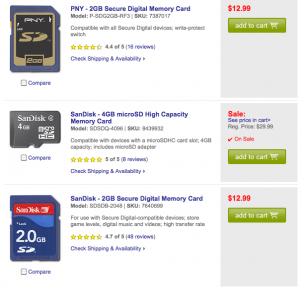
Easy to read information on product pages.

Best Buy product page

Product pages

• Make it easier for people to scan your pages and see the product names and prices.

• Create different color and/or size “add to cart” buttons.

• Look at your competitors and see what they’re doing right and follow their footstep (but don’t copy them exactly).

Manufacturers page

• When users click on a “Manufacturers” on the blue navigation menu (without selecting a particular item), there’s a list without images, make sure that you add images because it makes easier to scan through.

More website critiques

Limited time offer Free Video Website Critique for Small Business

Of course there are more things to review to make this website better such as search engine optimization, but this is a whole different subject and will require it’s own review.

If you’re reading this review and want to add more suggestions, please add your comments below.

Disclaimer

The video website critique and suggestions are for you to review and take what you feel will better your business website. There’s no guarantee that the suggestions mentioned will improve your business. Design Leap is not held responsible for any negative outcome.
Website Critique: Factory direct craft

Factory Direct Craft, a family owned craft supply business was started by a stay-at-home mom. Now for over 20 years in business, the company has an online presence www.factorydirectcraft.com and ships their products worldwide. Striving for perfection in customer service, they wanted a video website critique with suggestions on how to improve their website.

Limited time offer Free Video Website Critique for Small Business

Branding should be the priority of every business small or big. Having a consistent identity throughout your print and online marketing materials will make your business more recognizable. Studies have shown that it takes at least 7 times for a prospect to interact with a business before they buy something.

Overall Improvements

• Make sure that your store, blog, and forum all look the same. You don’t want to confuse your customers with multiple identities. Not all your customers enter your store directly from the home page.

• Update the look of the website to bring it to today’s standards. Keep in mind your target audience at all times. Remember that you’re selling to creative people, so don’t shy away from bringing some creative style.

Let a professional design your business logo and apply it across all your marketing materials.

• The top navigation should consist of the main categories that are on your website to make the shopping experience easier. The current buttons on the main navigation at the top are not the primary places where your visitors will go to shop on your site. These buttons could either be moved to the bottom of the website or made smaller and moved up next to the phone number.

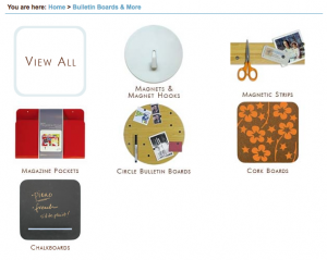
organized subcategories• Create consistency with all your images in size and style. You can also make the images on your multi-product pages a little bigger, this will let your visitors scan the products easier (seeing details) and in return shorten the time to add to cart. To the right is a sample of a subcategory view from www.sortingwithstyle.com.

• Move the description text that you have on each category below the products, this will bring the products higher up on the page. It’s great for search engines to have descriptive text on all your pages, but the reality is that most customers don’t actually read that information.

Homepage

• There’s a lot going on and nothing is calling attention of the user to dig dipper in to the site. It’s best to focus on one main thing or offer and give a call-to-action, it’s sort of like telling the user I want you to do “this” next.

Shipping page

• Make it more organized and easier to read. For example take a look at the Macy’s Shipping Information page, it’s easy to read and to scan to find the specific shipping information.

• Personally I think that your shipping and handling charge is too high. You can have great products and they might be priced right, but just having a high shipping cost can make your buyer turn to your competitors.

More website critiques
Of course there are more things to review to make this website better such as search engine optimization, but this is a whole different subject and will require it’s own review.

If you’re reading this review and want to add more suggestions, please add your comments below.

Disclaimer

The video website critique and suggestions are for you to review and take what you feel will better your business website. There’s no guarantee that the suggestions mentioned will improve your business. Design Leap is not held responsible for any negative outcome.

Website Critique: Elegant jewelry and crafts

Lorraine Davis, a jewelry and crafts designer has decided to start her own business and set up www.elegantjewelryandcrafts.com website to sell her designs. Designing jewelry and designing websites is a totally different art, below is a video website critique with suggestions on how to improve her website.

Limited time offer Free Video Website Critique for Small Business

In business, first impressions can make or break a sale, a connection, or even an opportunity. Websites are impressions of our business when we’re not there in person. Below are some further explanations and examples from the website critique video on how to make this website more professional and elegant as the name says.

Overall Improvements

www.displayimporter.com

www.displayimporter.com

• Set a style for your business and apply it everywhere. Let a professional design your business logo and include it on all your pages. Keep a unified look and color scheme that appeals to your target audience.

• Double-check, triple-check your links to make sure they are working and going where you intended them to go.

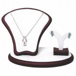
• Take professional photos of your products. If you don’t show your products as their best, how can you expect people to see their quality. Buy some jewelry stands and take photos against a white background, your images will look clean, unified and professional.

Homepage

• The homepage needs to have a call-to-action that prompts the visitor to do something: sign up for a newsletter, view gallery or anything else that you expect them to do. If you don’t tell them to act, they won’t.

• Remove 90% of the body text and replace with relevant information that the visitor wants to see.

Order Here page

• There’s no point to have a separate Order Here page. You need to combine your Jewelry page and Order Here page. When people browse your inventory, they want to know how much each item is and it’s information, they shouldn’t have to look for this information on a separate page. You can have a link from your gallery page that goes directly to individual product when clicked for more information.

Other recommendation

You might consider to sell your items on www.artfire.com, it’s a website where people buy and sell handmade products.

More website critiques

Limited time offer Free Video Website Critique for Small Business

Of course there are more things to dive deeply into making this site better such as search engine optimization, but this is a whole different subject and will require it’s own review.

If you’re viewing this review and want to add more suggestions, please add your comments below.

Disclaimer

The video website critique and suggestions are for you to review and take what you feel will better your business website. There’s no guarantee that the suggestions mentioned will improve your business. Design Leap is not held responsible for any negative outcome.