You may have heard a couple of weeks ago the worlds leading stock photo company Getty Images, is now offering embedding some of their 35 million stock images for free. This was exciting news to the online community, especially bloggers, who normally don’t have a big budget for purchasing images. However for small businesses this doesn’t change anything.
The free embedding of images from Getty is for non-commercial use only. Getty opened it for editorial use only; this means that you can only use the images in the content where there is a newsworthy or public interest event. You cannot use these images for free for advertising, marketing materials or sponsoring anything. Please review Getty terms carefully. As a rule of thumb, before using any image for business purposes, be sure to review all the licensing information.
A checkered background in Photoshop is not really what it seams to be. What it really is a way for Photoshop to tell you or actually show you that your layer doesn’t have a background and it’s actually transparent.
Let’s use this image of a rose as an example:
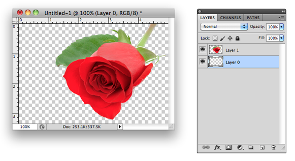 As you can see here there’s no background, it’s the picture of a rose. On the right is the Photoshop Layers palette and in my case I have 2 layers the rose on Layer 1 and an empty Layer 0 under it.
There are a couple of was to do this:
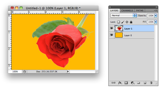
One way of doing this is to add a color or an image directly to Layer 0 (checkered layer) and that will get rid of the checkered background.
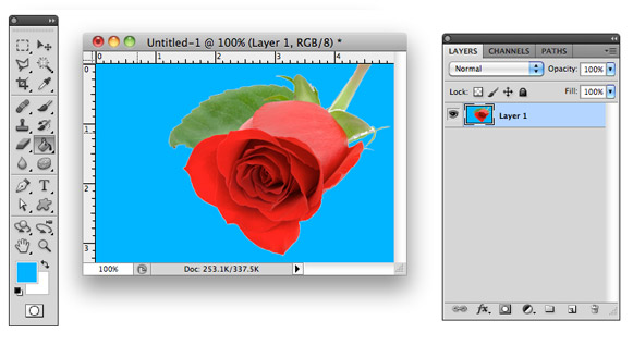
Another way is to delete Layer 0 and fill in the empty spaces directly on the layer with your image (Layer 1 in my case) using the Paint Bucket Tool  .
.
To make any image such as a banner clickable you will need to add HTML code to that image.
Here’s an example code that you can use:
<a href=”http://www.designleap.net”><img src=”image_name.jpg”></a>
replace www.designleap.net with any website where you want the image to link to
replace image_name.jpg with your image name (if your image is in a subfolder make sure you include the correct location)
 For search engines an image is just a block that they cannot read. So to help search engines recognize images on your business website you have to include an ALT tag in the HTML code. To check if an image has an ALT tag just hover your mouse over an image and if you see text appear next to your pointer, then there’s an ALT tag associated with that image.
Here’s a sample HTML code for an image that includes an ALT tag:
<img src=”image.jpg” alt=”image description goes here”>
Go ahead and mouse over on the image to the right to see the ALT tag in action.
